The Composition of Color
The sensation of color depends primarily on the composition of light which is a mixture of white light and colored light (which in itself can be a mixture of wavelengths as in the case of purple). The colored light may have a dominant wavelength or hue and the extent to which the hue dominates is known as saturation (or chroma). The saturation decreases as the hue is deleted with white light.
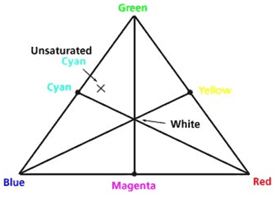
There are 3 receptors in the eye that respond to different wavelengths. This leads to attempts to chart colors by a mixture of three primary lights. Figure 1 shows James Clerk Maxwell's color triangle with the three apexes representing three primary colored lights: blue-violet, orange-red, and green. A great number, but not all colors can be produced by mixing lights of the three primary colors. A specific color, for example an unsaturated greenish blue, can be represented by a point on the triangular grid.

Figure 1. The color triangle attributed to James Clerk Maxwell. At the apices are the additive primary colors and at the edges, the subtractive colors. Many, but not all colors can be represented as a mixture of the three color lights. The nearer a point is to an apex, the higher the proportion of light of the color represented by that apex (adapted from H. Rossotti, COLOUR,(Princeton, 1983)).
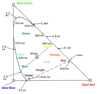
In order to represent all colors, 3 imaginary or "ideal" primaries are used. The Commission Internationale de l'Eclairage (CIE) defined in 1931 (modified in 1967) the chromaticity curve with standard observer and 3 ideal standard sources. The chromaticity diagram is constructed (Fig. 2) by drawing a color triangle with 3 ideal (but non-existent) primary colors at each corner. The x-axis is the amount of ideal green that would be mixed with blue. The y-axis is the amount of ideal red that would be mixed with blue. A given color is represented by values along the two axes.
Superimposed on the triangle is the CIE chromaticity curve which places the band of pure spectral colors as a solid curved-line from violet up to green down to red. The dashed line connecting 380 nm and 700 nm are the nonspectral colors of purple obtained by mixing violet and red light beams. All the colors that we can see are contained within the area bounded by the solid and dashed lines. The central point W of the diagram is the white produced by an equal mixture of the three primaries.

Figure 2. The CIE chromaticity diagram showing wavelengths in nanometers (nm) and energies in electron volts (eV). The area enclosed by the curved line and dashed segment include all visible colors. The pure spectral colors lie along the curved edge. (Adapted from Nassau, The Physics and Chemistry of Color, (Wiley, New York, 1983)).
We can represent a mixture of two spectral lights as a point on the line joining the light point on the spectral curve. The dotted line in Fig. 2 joins the blue light at 480 nm with the yellow light at 580 nm. Following the dotted line we would proceed from spectral (or saturated) blue to pale blue to white to pale yellow to saturated yellow. Thus, a mixture of the correct amounts of 480 nm blue light and 580 nm yellow light gives any of the colors located in between. Similarly the purple colors can be formed by a mixture of red light with violet light as specified by the dashed line. A pair of colors which can produce white (the line joining the two colors passes through the white point, W) are called a complementary pair. Thus blue light and yellow light form a complementary pair as do orange (600 nm) and blue-green 488 nm, also called "cyan". We can now use the point W as the origin and describe color as a mixture, in a certain proportion, of white light of a given wavelength. This wavelength is referred to as the dominant wavelength and the color associated with this dominant wavelength is called the hue. We thus describe the sensation of color in terms of hue. The amount of hue that makes up the composition of light is known as saturation (also designated as "chroma"). The dominant wavelength points on the spectral curve (solid line in Fig. 2) are fully saturated. As the dominant wavelength or hue is diluted with white light, the saturation decreases. For example, to describe a beam of pink-appearing light (point D in Fig. 2) as unsaturated orange hue of 620 nm.

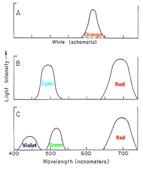
Different ways of obtaining metameric beams of pink light. Each implies mixture with white light to obtain pink light, A) by orange light, B) by mixing red with cyan, or C) by mixing red, green, and violet. To the eye, these metameric colors would all appear the same. (Adapted from Nassau, The Physics and Chemistry of Color,(Wiley, New York, 1983)).
There are many ways to produce the light at point D (or any other point): one hue plus white, two spectral colors or three. These light mixtures are illustrated in Fig. 3 where A) shows orange and white, B) blue-green (cyan) and red, and C) violet, green, and red. These three mixtures would appear the same to the standard observer.
Want to try activities highlighting these principles? Click on the name of this activity to find an easy, hands-on experiment:


